Role & Team
I was the sole UX designer on Amazon Autos' new Seller Registration & Verification initiative, working alongside a PM, TPM, program manager, two SDMs, and a principal + senior engineer, with partner teams across Seller Success, verification (RVS/FRM), and L&D. I owned the end-to-end experience — and unusually, the deliverable itself: a working coded prototype that served as design, spec, and handoff in one.
Background
Amazon Autos onboarded car dealerships through Sell on Amazon (SOA) — a flow built for retail sellers, never for dealers. Dealers answered retail questions about UPCs and FBA, submitted six documents, and went through verification checks designed for a different business. For Q3 2026, the org committed to replacing SOA with an independent, automotive-native registration and verification experience. My job was to define it.
Problem
The retail flow was measurably costing the business qualified dealers:
"I find it weird that Amazon requires a utility bill to verify my address when I'm already submitting a government-issued ID that displays my address… the additional address verification document seems redundant and I don't feel comfortable providing that information."
— General Manager, Volvo Car Walnut Creek
The pattern was measurable:
Onboarding spanned 6 separate systems and took 75 days from contract signature to launch — plus 12 more days for every verification failure — capping capacity at ~70 dealers a month.
90% of applications triggered manual intervention during verification, despite high-touch support from Seller Success Managers.
Documentation was redundant — bank statements, letters of authorization, and utility bills proving things a government ID already showed.
The language was wrong — dealers don't think in UPCs and FBA; they think in dealer licenses, OEM IDs, and franchise agreements.
Process
Instead of designing static mockups and hoping they'd survive engineering scrutiny, I made a bet: skip Figma entirely and design in working code from day one.
First, I dropped the PRD into an AI agent, which generated a static first pass of the UI. That became the artifact for the first stakeholder conversations — something concrete to react to within days, not weeks.
Then, I moved to Stores Designer, an internal AI design tool, and built a working prototype of the entire flow: real navigation, states, document uploads, and verification progression. Every review from then on happened on the real thing. When feedback came in, I updated the prototype and kept iterating until final.
The handoff was the prototype itself, with annotations and comments embedded in it. No spec document, no redlines.
Research
Discovery combined dealer feedback, operational data, and a policy review that secured ten policy approvals to remove redundant checks. It pointed to four design mandates:
Strip everything retail
Speak the dealer's language
Ask for information only once
Make verification status legible at every step
The biggest structural change: cut required documents from six to two, and validate dealers through automotive markers — DMV license, OEM website — instead of generic retail checks.
Solutions
1. An automotive-native flow, designed in working code
Before: the SOA retail flow — six documents, retail terminology, and features (FBA, fees) that had to be manually reversed for every dealer before launch.
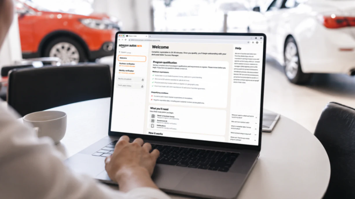
Now: a guided four-phase flow — registration, data collection, verification, launch — asking for just a dealer license and a personal ID, in dealer language throughout, with a persistent stepper and contextual help. Because I designed it as a working prototype, every state, edge case, and piece of copy was already resolved by the time engineering started.
Business verification: the two-document model with automotive-native options and inline help, replacing the six-document SOA burden.
2. The prototype as the engineering handoff
Before on past projects, design reviews ran on static mockups — partner teams and engineers interpreted screens differently, and doubts surfaced late as back-and-forth and extra review sessions.
Now reviews ran on the working prototype. Partners clicked through the real flow, so doubts were cleared in the room, and design reviews were the smoothest of any project I've worked on. Under the hood it was a real React app built on the same internal design system as production — same components, same tokens — so engineering could migrate two layers directly instead of rebuilding them:
Presentation layer: structure, styling, and component layouts, matching the approved design exactly.
Client-side logic: interactive elements, frontend validation rules, and the flow's state transitions.
What they built from scratch was everything behind it: APIs, document storage, and the live verification services.
Result: engineering shortened the development estimate by two weeks.
Impacted KPIs
Metric | Before | After |
|---|---|---|
Systems dealers navigate | 6 | 1 |
Enrollment (contract to launch) | 75 days | 25 days (−65%) |
Manual intervention rate | 90% | <30% |
Onboarding capacity | 70 / month | 250 / month |
Required documents | 6 | 2 |
Development estimate | Baseline | −2 weeks |
Reflection
The biggest lesson was that a working prototype communicates what static mockups can't. State, interaction, and edge cases are where alignment breaks down — and letting partners click the real thing resolved doubts before they became review cycles. Building on the production design system made the prototype the handoff: the front-end mapping was near one-to-one.
The honest mechanism behind the two weeks saved: engineers didn't ship my prototype code as-is — they owned the backend, APIs, and real verification. What the prototype removed was ambiguity. Every product decision was already made and demonstrated, and that's what compressed the build. If I did it again, I'd bring engineering into the prototype even earlier, using it to pressure-test API contracts while the flow was still taking shape.