Context
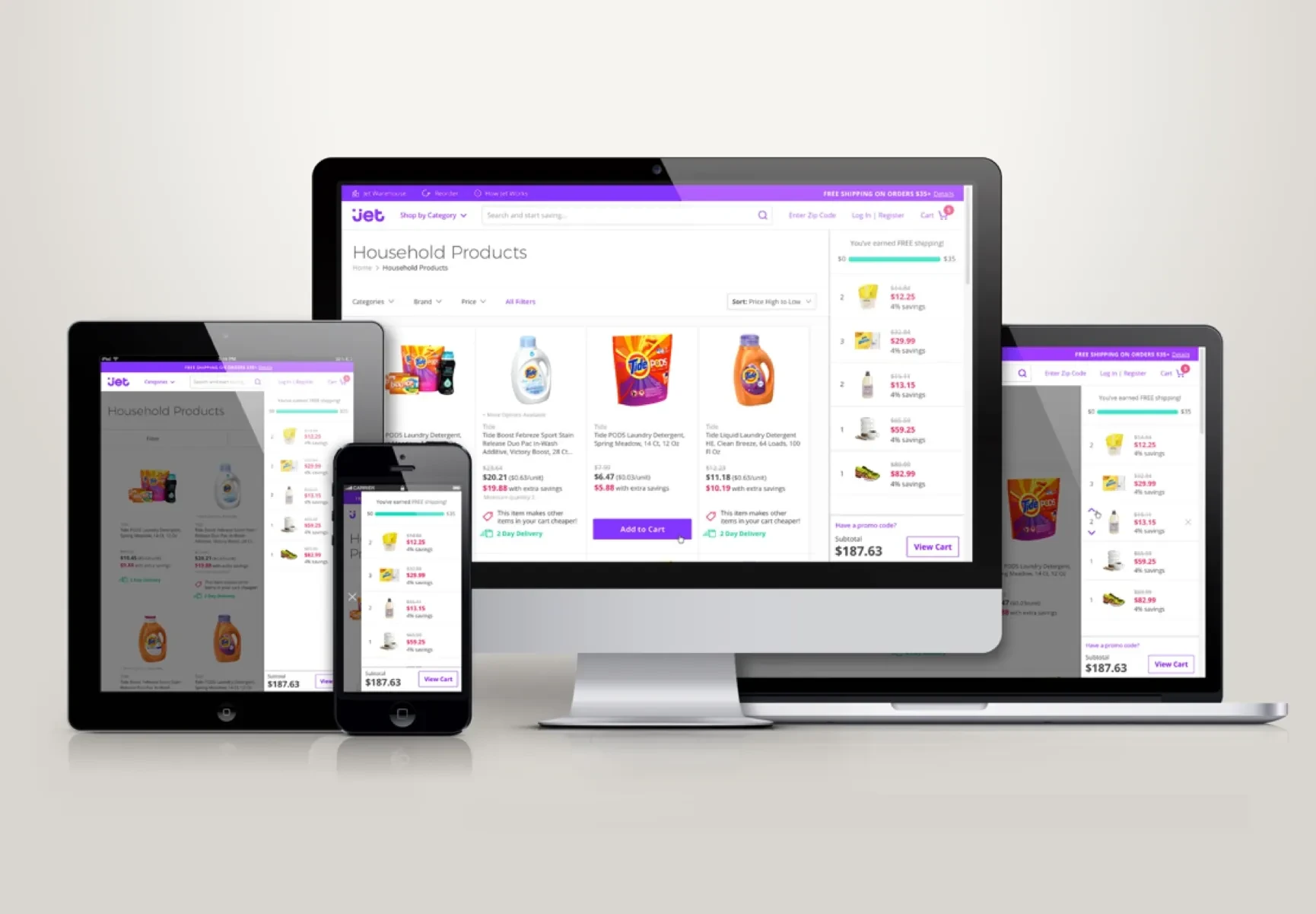
I joined Jet.com as its first designer, when the company was twenty people in a single room, and left as part of a 1,500-person business acquired by Walmart. Being first meant the remit kept changing: make the vision credible, then make the product real, then keep the business alive long enough to matter.
From a sentence to a shipped product
When I started, the CEO's vision had no visual representation. It was one sentence, and Series A funding depended on investors believing it described a product.
“Jet will find operational efficiencies around e-commerce logistics and translates them into savings for its customers.”
I built the prototypes for that pitch. They raised the round and then outlived it, becoming the reference the company argued against for the next year.
Once funded we grew fast, and launch got chaotic. The team split into squads with one owner per surface — homepage, search, checkout — so decisions had a name attached and the surfaces still added up to one product. That structure held through launch and survived the team tripling in size.
I focused on the core purchase funnel first; once it was live and running, I took on design leadership for the native apps.
Making the apps worth having
The team had spent everything on the web, so the apps were the website in a shell. I mapped what the platform could do that the web could not, and used that map to argue for a native roadmap rather than parity work.
The filter I applied was Jet's own pricing engine. Prices moved with the real cost of fulfilment: items shipping from the same distribution center cost less together than apart, and waiving the right to return dropped the price again. Bigger, better-consolidated baskets were literally cheaper, so features that brought more people into one cart served the customer and the unit economics at the same time.
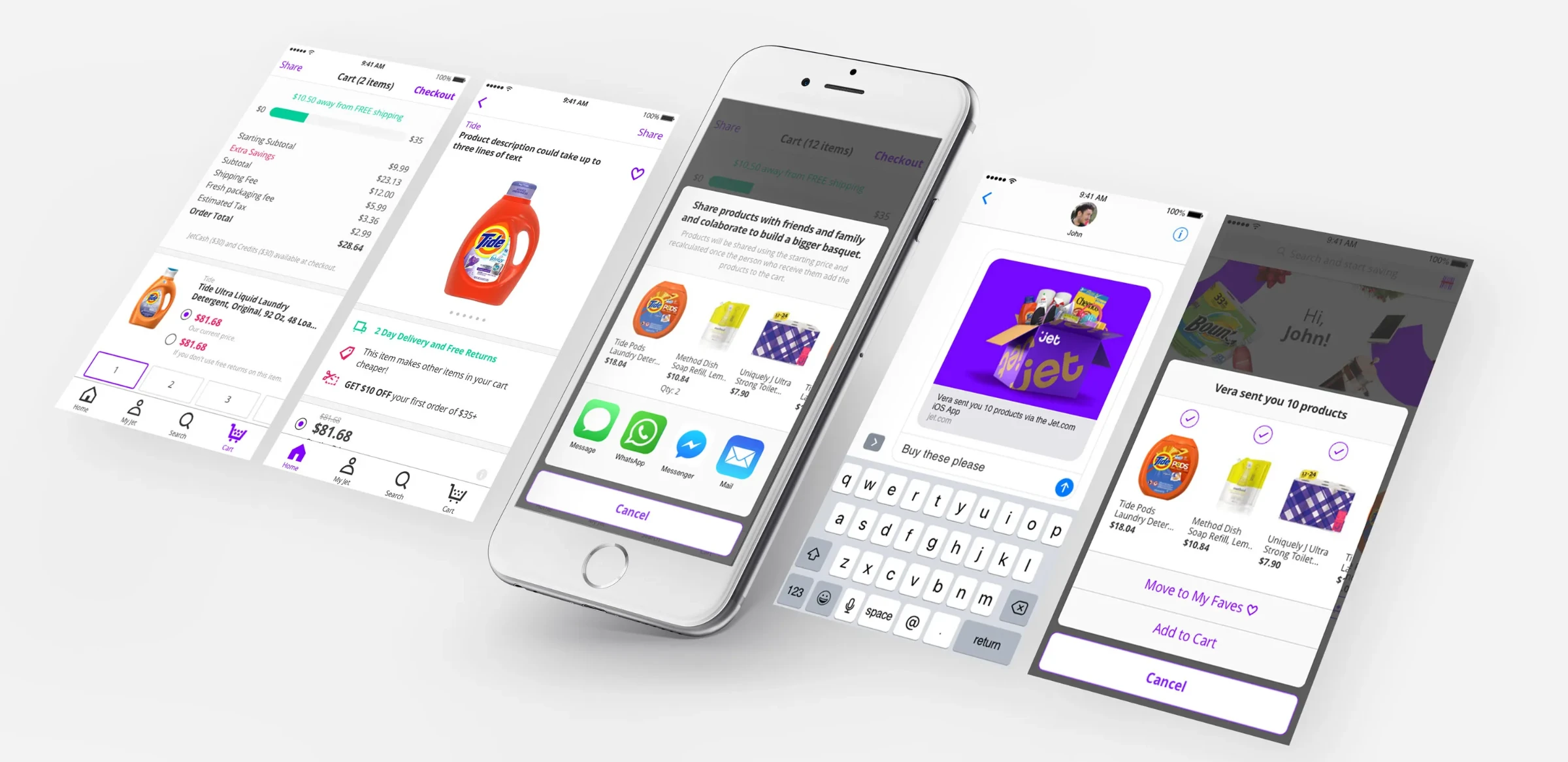

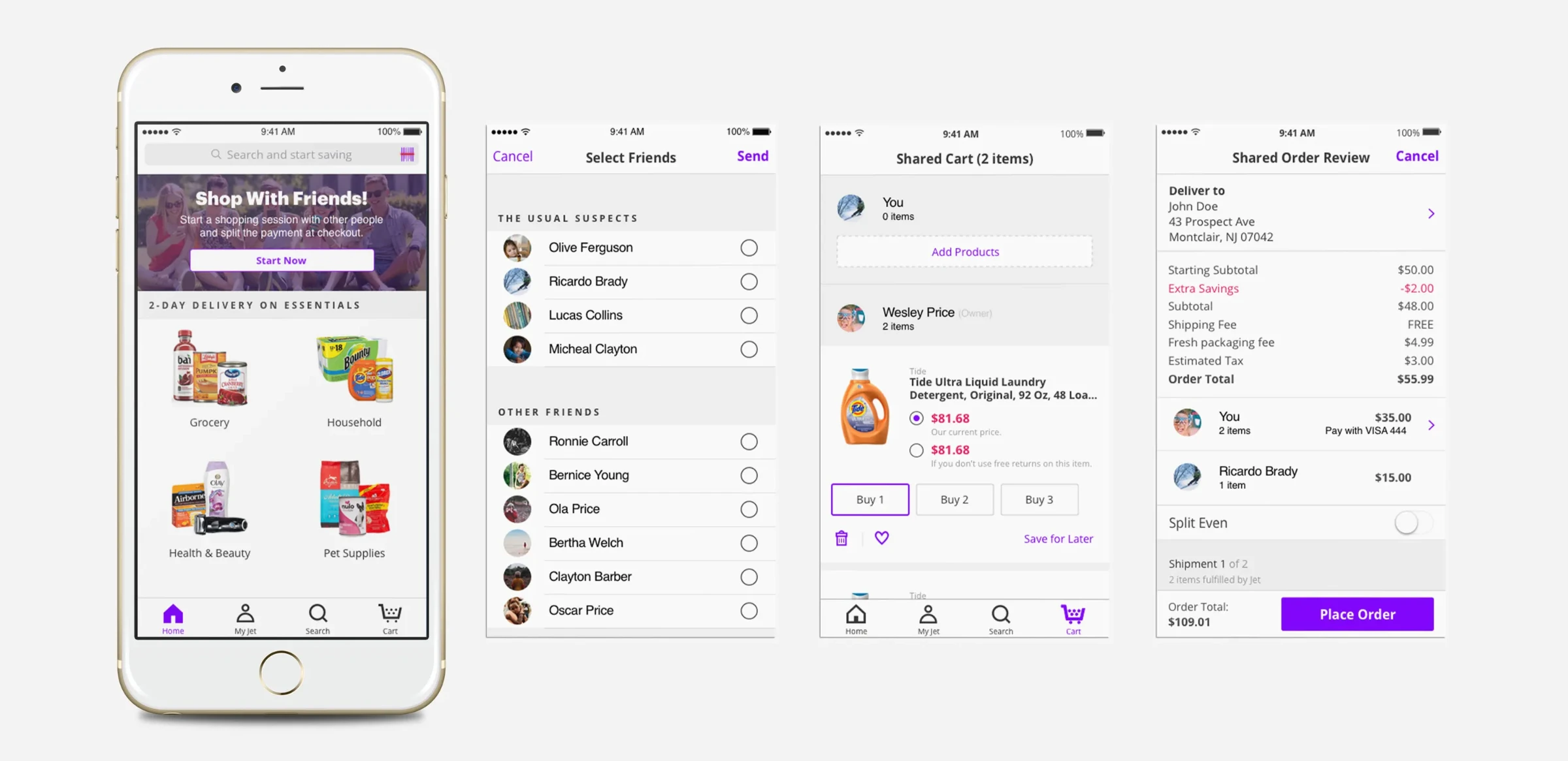
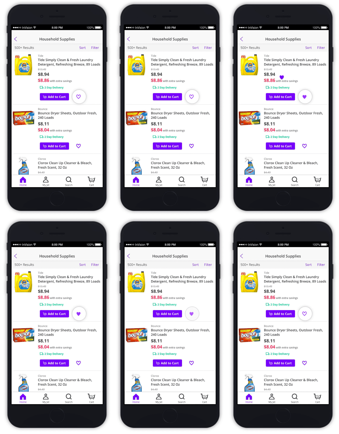
We also used animation to carry the brand voice — bold, witty, joyful — and to teach mechanics that would otherwise have needed explaining.
The bet: retention before conversion
Late in Jet's independent life a new optimization squad was created, and I led design for it. It was the hardest work I did there and the last of it — the metrics we moved were the metrics Walmart was reading while it decided what Jet was worth.
Jet had raised $350 million that November and was spending most of it on product listing ads. Bounce rate on the pages that traffic landed on was 98%. The company was buying visitors and losing effectively all of them, which meant the growth story the company needed to be bought on its own terms was not there — and at that burn rate, neither was the runway. The economics were not a secret either: the Wall Street Journal had already reported buying twelve items from Jet for $275.55 that cost the company $518.46 to fulfil.
The instinct in the room was to push on conversion, because conversion is the number investors ask about. I argued the opposite: conversion work on a page that loses 98% of arrivals optimizes a rounding error. Fix why people leave first, then move down the funnel. That sequencing was the decision the whole project rested on.
Evidence
We ran user testing on the product detail pages where the ad traffic landed. The sessions kept returning the same cause: the pages were thin, and gave a first-time visitor no reason to trust an unfamiliar retailer with a basket.
Rather than redesign the page once, we tested the reasons to stay one at a time — the value proposition, a promotion, related products — so we would know which change earned which point of bounce rate.
Read together, the sequence says something more useful than any single win: what visitors needed was not a better page, it was a reason to believe the savings were real before they committed anything.
Outcome
In one month the product detail page went from thin to substantive, and the funnel changed shape: we retained 35% of the traffic we had been losing and conversion rose 30%. The ad spend that had been returning nothing started returning something. Four months later Walmart announced it was acquiring Jet for $3.3 billion.
What I take from it
Two years at Jet taught me to read which problem a company actually has. The same design team, in the same year, needed a storyteller to raise a round, an organizer to survive a launch, and someone willing to argue against the obvious metric to keep the business alive. Knowing which of those the moment requires is the part that took longest to learn.
It also set how I work now: find the number that decides whether the product has a future, get evidence for it faster than anyone expects, and make the tradeoff explicit enough that a room of non-designers can disagree with it productively.